


Charts & Graphs

What's this all about?
"A PICTURE IS WORTH A THOUSAND WORDS," ... or so it is often attributed to Frederick R. Barnard, an advertising executive who used the phrase in a 1921 article promoting images in advertising. He's correct, especially for the many readers who are dyslectic (about one-third of the population including me -- Van Lewis).
The purpose of this page is to post charts and graphs of the many things that go into general economic issues and real estate in particular.. Visualizing trends and numbers gives perspective to many readers about business cycles, population and age distributions, and monthly-annual reports, e.g. home sales and interest rates.
With this in mind, please enjoy the following list of charts and graphs showing what Pete and I thinks are important factors for home sellers and buyers.
DATE: 11-11-2025


10-yr Treasury yield up 11-11-25

Charts are national stats and sales, not metro-Denver

DATE: 10-9-2025 refi's 30-yr mgts
National Sept home closings


For more charts and graphs, click Here.
The "tipping point" to get buyers buying is forecasted at 6% - seems reasonable

Dated 8-4-2025


Heading 1
Dated 8-11-2025

Dated 8-3-25 Denver Post story and maps

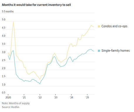
Dated 7-31-2025 WSJ article: National re-sale data showing latest spreads between condo and single family home sales. Read article in Current Real Estate page for more details.


See great WSJ article ECO page dated 7-29-25 about the interest rate that matters the most -
Bonds!
To learn more about this population chart, please go to either of our website pages herein ECO or Good to Know for the WSJ article dated 7-28-2025. It is a very interesting article about present and future problems resulting from shrinking vs growing populations around the world and what it means .


